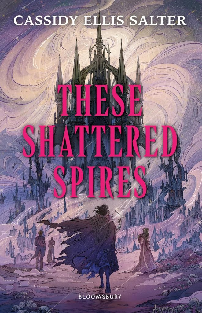
Everything has kicked into gear in the last few days, and more importantly – more excitingly! – Bloomsbury have finalised the cover for These Shattered Spires, the first book in my big, weird, bony gothic fantasy trilogy. Every author hopes they get a cover they love: our books are precious and it’s hard handing them over to other people; I want my book to sell a million copies as much as the marketing team does, but it’s also my baby and I have Opinions.
I shouldn’t have been nervous, because it turns out that my editor and marketing team are really, truly fantastic, and they let me have a lot of input. But before I go any further – because I want share other stuff with you! – here’s the final cover for These Shattered Spires in all its tooth-swirling glory.

This is the UK cover. The US cover is going to be slightly different, mostly in font and brightness, but it’s still very recognisably the same book.
How are book covers designed?
The cover process is probably different for everyone (and my first experience, when I was publishing Middle Grade fiction, was far less involved). For These Shattered Spires, it went like this:
1) My editor asked if I wanted to put together a mood board of covers, character art, and art styles I love. The answer was obviously yes, I was born for this, don’t talk to me for twenty-four hours because I’m going to be stuck to my laptop and working on aggravating my wrist injury while I hunch over the internet, thanks very much. I’m a big fan of both illustration and bright gothic font, so there was plenty of that – I’m pretty sure the original cover of Ava Reid’s Lady Macbeth was on there.
2) The team came back with three potential artists they had sourced for the cover. They were all fantastic, but my vote was for Danlin Zhang, who came on board to my heart’s delight, and whose other work you should definitely check out.
3) There are several stages of sketching before anything resembling the final cover happens. First Bloomsbury briefs the artist, then the artist comes back with loose sketches of composition choices, and we all express which one we like the most (which I think was pretty unanimous).
4) More sketches with more detail! Some greyscale shading too, for the drama.
5) Final composition chosen. I was a big fan of having Taro, who’s the character in the foreground, tossing the bone (AKA a curse key) because I love the sense of movement. It looks like she’s about to stride into battle with nothing but a jawbone to keep her safe. Which is basically what happens, because she it way too confident in her fighting abilities, which realistically are zero.
6) The rough cover gets a few colour treatments. This basically involves applying a bunch of different colours to the sketch and adding matching title text. This is also to help decide which colour scheme the next two books will be, as they’ll all be different.
7) Everyone gives an opinion, and we go for this glorious gothic purple-pink colour. The artist starts work on the final illustration.
8) The illustration comes back! There are some very minor tweaks, mostly me being An Author. At this point the castle on the cover image already lines up with the map. (Yeah! A map! It truly is a fantasy book.)
9) And finally the layout is finalised; the font, my name (which feels pretty weird), the Bloomsbury logo, and all that other technical stuff, after which it goes live and everyone can see what it looks like, no take-backs.
Things I didn’t know about book covers until now
- My editor offered to send me a ‘wet proof’. I was kind of expecting something like when I ordered my first ever bagel in New York and it came with a damp gherkin in a bag (a positive, I love pickles). A wet proof is a physical print-out of the cover that looks exactly like it will on the book, colours and all, because some things don’t like the same on a screen.
- The cover illustrator (i.e. the person who creates the artwork, if there’s original artwork on the cover) is not the same person who designs the layout. The artist deals with their side, leaving room for title and author name etc., but a separate designer puts it all together. I kind of thought it all just came from the same place.
- The cover of the ARC (Advanced Reader Copy) doesn’t have to be the same as the finished book. These Shattered Spires is getting some very cool ARCs with character illustrations on the front, which as far as I know will only be available at certain events.
Could I be more thrilled? Absolutely not. (Until I share the character art, which will probably finish me off. 🖤)
